After the last Glen Coe Skyline, I found myself wanting to play a bit with the data. First of all because it is such a nice race and secondly because there are a lot of intermediate times to play with.
Of course everybody knows who won the race, but have you ever wondered who was the fastest between Stob Coire Sgreamhach and Bideam nan Bian? Or the fastest descending to Loch Achtrician? Or the fastest climbing Curved Ridge or running over Aonach Eagach? Or even the fastest running home over the West Highland Way? Well, you can see it in this chart.
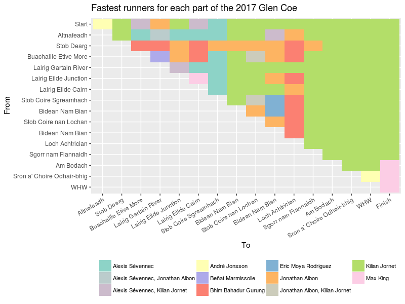
You want to be in the upper right corner, because that is where the race is won. We clearly see that Kilian Jornet dominated in the part after Loch Achtrician. Before that, many different runners ran the fastest times over various parts. And in the end, it was Max King who hammered down the West Highland Way with some very fast running. A remarkable one is André Jonsson who ran the fastest time from the start to Altnafeadh and then another fastest time dropping down to the West Highland Way in the final moments of the race. He clearly didn’t just fade away after that quick start.
So, that is for the very elites. Can we take a look at the pack as a whole? Sure, why not. Below, you can see for all runners the running time as a function of the distance [note1].
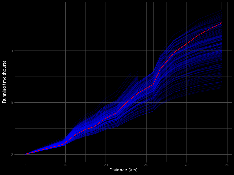
Each blue line represents one runner and each of them wants to be as close to the bottom of the chart as possible. One runner is special enough to be drawn in red instead of blue. That happens to be me. You also see a few vertical white lines. Those indicate the time limits. You have to pass under those lines, otherwise you are timed out. It is clear that only the time limit at Loch Achtrician poses problems to some people.
What I like in this visualization is that you can see where you are with respect to the pack. How long ago did the first runners pass? Are you more to the front or to the back of the pack? You also see very nicely the formation of little packs as the race progresses. Those are the brighter bands in the rightmost part of the graph. The biggest inconvenience is that you absolutely don’t see what is happening in the first half of the race. Everything is there so close together that it is impossible to see any details.
So, I tried something different. The graph below shows more or less the same, but instead of running time I use the position in the race.
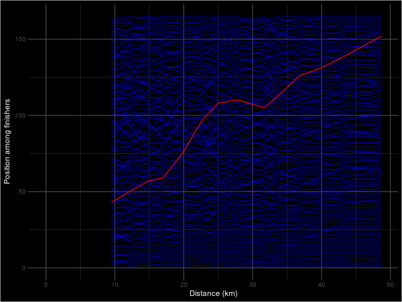
Again, each blue line represents a runner and I am the red line. I removed all non-finishers and also Bjorn Verduijn and Peter Toaig because most of their intermediate times are missing which messes up the graph.
Apart from being a lot more messy than the previous graph, the first thing that I remarked was how clean the lines for the first 20-25 runners are. They are more or less on their position from the start and only shift positions occasionally. That is the kind of strong and stable that you don’t expect to see in the UK nowadays. It also means that if you are not among the first runners from the start, you will not get there anymore.
Among the other runners, the positions shift a lot more. The further the race progresses, the more the positions become stable. But until the end you can see some big shifts.
What are you saying? You don’t really care about me, but rather would like to see yourself or some other runner in red? Would that be possible? Sure. Why not? I’ve made a little page where you can find the same plots, but that allows you to select any runner for highlighting. It uses a free plan, so if it would be too popular it might become unavailable for a while. Users of R can download the code of the shiny app on github and run it locally if they want to.
Feel free to leave any comments or suggestions for improvement.
[note1]: getting the distances of the different checkpoints was surprisingly hard. I didn’t find them anywhere on the website. My first idea was to estimate based on the course profile. Unfortunately, that appears to be drawn with some kind of rubber ruler as the distance between kilometer 10 and kilometer 20 (147 pixels) is about 20% longer than the distance between kilometers 40 and 50 (120 pixels). So, I decided to use the GPS track that can be found on the race website. But as is stated there, it is “only roughly drawn to show the route”. Annoyingly enough, it has a total length of only 48.7km instead of 55.